For this week’s lesson, I was taught some of the basic concepts about layer masking in Photoshop. Here are my results after giving a few assignments a try.

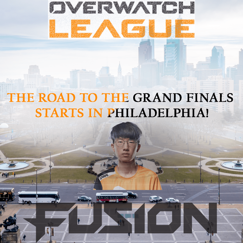
For the assignment first assignment, there wasn’t any real techniques or design principles I used. There wasn’t any motivation behind it either. I mostly saw it as an opportunity to experiment and learn what was I was taught. The second assignment is a bit different, however. Unlike the first one where we were told what size to make the project, I decided to go small with 10 inch by 10 inch canvas. The resolution comes in at 150 ppi and the color mode is set to RGB. As for the design aspect, I decided to with an esports theme. As an avid fan of the Overwatch League, I wanted to make something creative to advertise the League’s upcoming games in Philadelphia. I wanted to make sure I captured the theme of this city by taking a photo of it and adding the team name and their star player. And to make sure people understand it’s about the Overwatch League, I made sure to include some sort of representation for it at the top of the screen. For tools, I made use of transparencies, exposures, and most importantly layer masks. For the title on top, I used a layer mask with a low opacity paintbrush. To make it look visually appealing, I used the dissolve feature. For the text towards the middle of the screen, I didn’t use a layer mask. But I did give it a black and orange gradient overlay to make it match the team colors of the Philadelphia Fusion. The text is the thing I want people to pay attention to and read since it’s trying to send a message. To make it stand out, I applied a layer mask to the picture of the city. Using a low opacity paintbrush, I painted in white right where the text was. Not only did this make the text more visible, but it also gave off a nice fog effect that I think adds to the piece nicely. For the player I put on there, I gave him the hide all layer mask. I wanted his presence to be subtle. He’s the star player on the team but he’s not the main focus. The goal was to make his presence be known but not take away from the rest of the piece at the same time. A layer mask was also given for the bottom layer for the same reason essentially. I didn’t want it to stand out more than the message but it’s important to have it be there since the Fusion are the team from Philadelphia. It implies that the road to the championship starts with them in their home city. With that said, the big design principle I focused on was emphasis. While I think I could’ve done better with it, I think I did make use of some negative space. The center of the screen is where the focus is but there is space on the left and right to give it breathing room.
