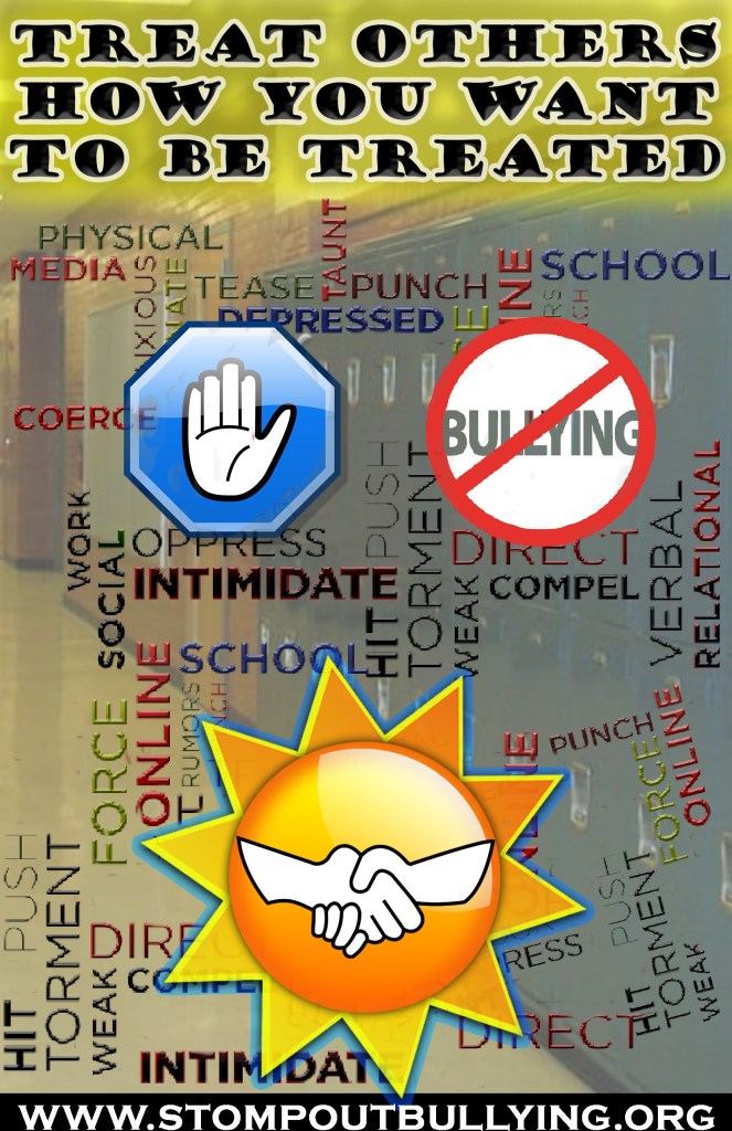
For this week, I was asked to make a social awareness poster. I decided to center the theme around bullying through both symbols and words. As someone who cannot stand bullying, I felt a desire to make my own personal social awareness poster of it. After initially getting some inspiration online and thinking about unique ways in which I could raise awareness, I ultimately came up with the final product you see. I wanted to make it clear that there are a ton of words and actions that can be considered bullying. I know it may feel a bit chaotic but that was the point. I want those who look at this to feel overwhelmed in a way because that’s how bullying makes people feel. There is so much that can be used to hurt someone I wanted to express that. For the technical aspects, I went with an 11 inch by 17-inch size with they typical RGB color mode and 150 PPI. When it comes to the work itself, the big technique I applied was layer masking. I used it on things like the sun, the school background, and some of the smaller bully words. I nondestructively adjusted transparencies and hid anything that looked undesirable. To make the website at the bottom stand out and not get lost amongst the chaos, I used the rectangle tool and filled it with white. For the slogan at the top of the screen as well as the bully words, I used the bevel and emboss effects to make them pop out a bit more. To make the top slogan be a bit more noticeable, I made a layer under it and painted it a low opacity yellow. Another thing I did was give a blue outer glow to the sun to make it appear a bit more interesting. One design principle I absolutely kept in mind for this is negative space. Before copying and pasting the bully layer a few times, it felt like there was too much-unoccupied space. To make it feel like there was not an overwhelming amount of it, I added in more words.