Be yourself; Everyone else is already taken.
— Oscar Wilde.
This is the first post on my new blog. I’m just getting this new blog going, so stay tuned for more. Subscribe below to get notified when I post new updates.
Be yourself; Everyone else is already taken.
— Oscar Wilde.
This is the first post on my new blog. I’m just getting this new blog going, so stay tuned for more. Subscribe below to get notified when I post new updates.
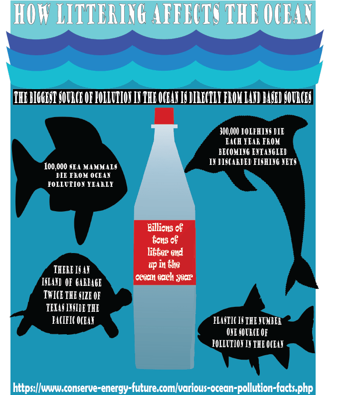
For my infographic, I decided to focus on littering and its overall impact on marine life. A lot of people don’t realize how much marine life suffers as a result of humans being careless so I felt the need to spread awareness of some of the consequences of our actions. For the data and research aspect, I found some interesting facts over at the conserve energy future website. It lists many interesting facts about ocean life and how it has changed thanks to irresponsible human behavior. When it comes to my design process, I felt like a fun direction to take would be to have different marine life staring down a giant plastic bottle as it sends many different messages. For one, they have no awareness whatsoever about how that plastic could harm them but it goes to show what they are swimming with these days. For the typeface, I simply wanted something that was readable but also not too boring or generic. I also made the typeface in the center different from the other facts just to have it stand out on the bottle a little more. The sea life and bottle you see are copyright free vector images found online.
For this assignment, I was asked to make my own custom logo using the tools in Adobe Illustrator. My inspiration behind the design is my own YouTube channel. With this logo, I knew I wanted it to be centered around something that represents me and a subject that I feel passionate about. That made the choice easy to make a microphone. A microphone is something I’m around all the time. It’s the thing I used to make my own business that I grew all by myself. I’m proud of how far I’ve come and the logo represents what I used to achieve success. As for the letters in it, well, to put it simply, my YouTube name is ATP is I knew I had to incorporate it somewhere in the design.
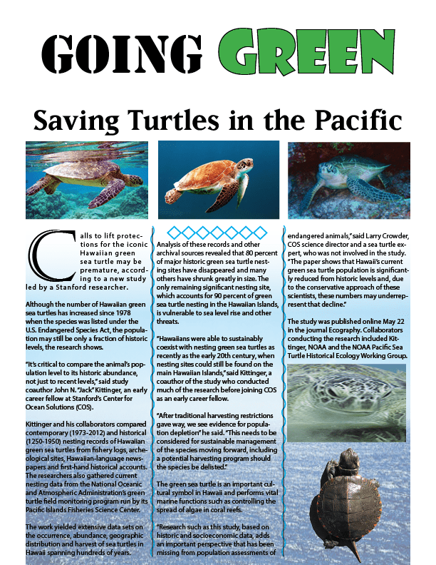
For this assignment, I created the single page turtle article by following the video for technical guidance while also using my own creative freedom to make it look more like I made it myself. Simple things like making the word Green in the title the color green with large text is an example of this. The diamonds and the squiggly lines were also creative aspects of it that came from my own personal vision. Because I don’t like it when words are slanted all over the place since I find it hard to follow, I put all of the pictures in places where they would have good spacing while also not having them interfere with the text.
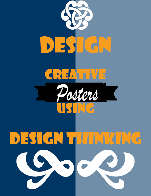
For one of this week’s assignments I was asked to follow a step by step guide for basic poster to help get used to Adobe Indesign. With this being a step by step process, there wasn’t too much I could follow in terms of the design process other than making sure the spacing and color schemes looked decent. In terms of creativity, I really felt motivated to go for a blue, orange, and white combination as it reminds me of my favorite basketball team which is the New York Knicks. I’ve always felt those colors really pop together. Other than that, I just picked a random font that I thought looked good as the goal after all was to play around and have a little fun with this assignment.
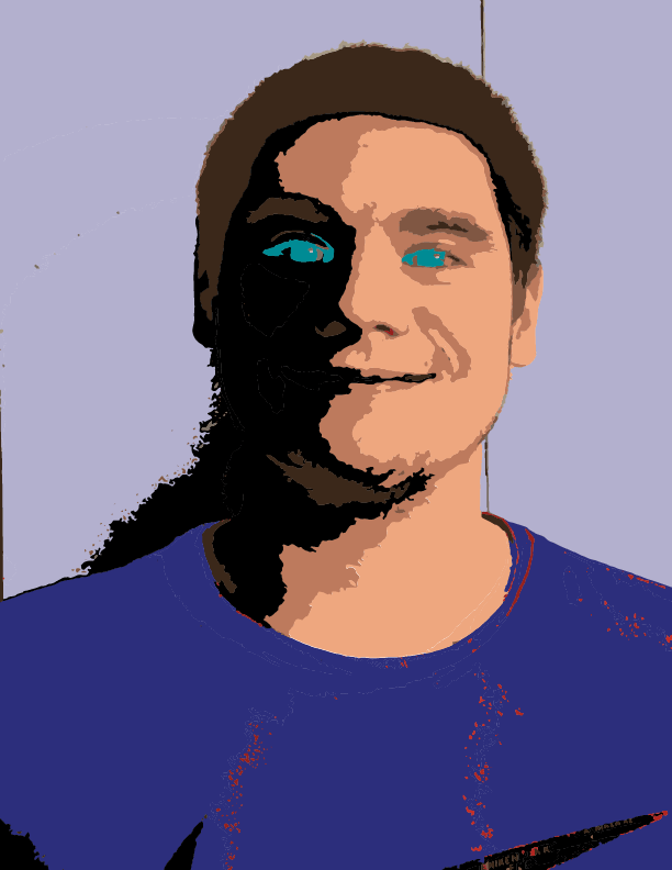
With this project, I was asked to experiment with the image trace feature of Illustrator. The photo you see is a traced one of myself. The design was pretty simple but I for one think it came out good. I traced it using 10 colors then made have of my face dark to make this light and darkness contrast. It gives off this nice theme of the good and evil that human beings possess by nature.
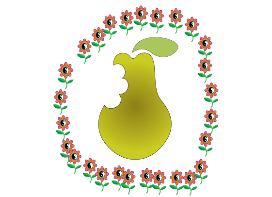
For this assignment, there wasn’t a lot of artistic freedom or design processes that I followed. I mostly wanted to make sure I could do the assignment correctly while being to learn how to properly use the pen tool. The only things I did that did not follow the assignment were adding color to the pear and leaf, giving the piece a border of some sort, and scaling down the leaf to a size that I liked. For the border, I wanted to keep it nature-themed, hence why I chose the flowers.
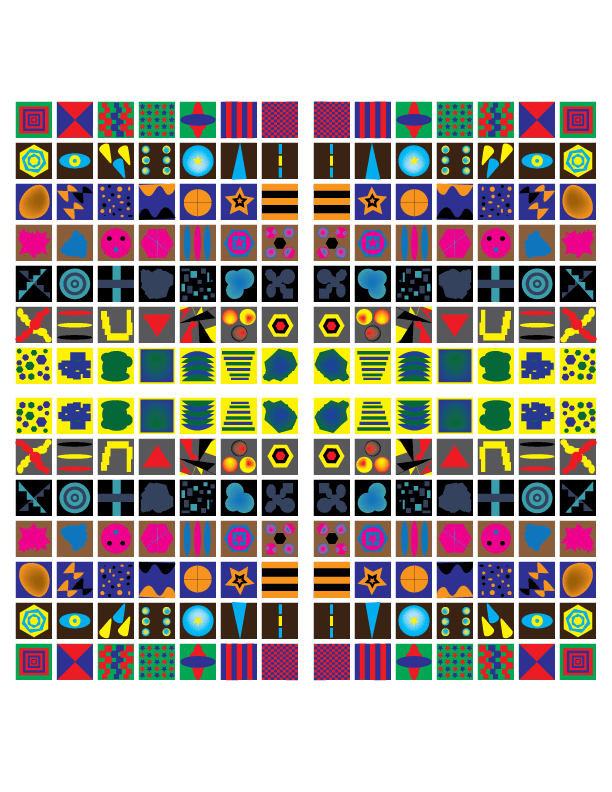
For this project, I didn’t have any specific design ideas. The only thing I knew is that I wanted every box to have different shapes and patterns made from shapes and the pen tool. For the colors, I used with the shapes patterns, I themed them around teams I follow. As for why I choose the background colors I did, I mostly tried to find basic colors that would help boxes with negative space pop. Making sure the boxes looked evenly spaced during the whole process was also something I constantly kept in mind.

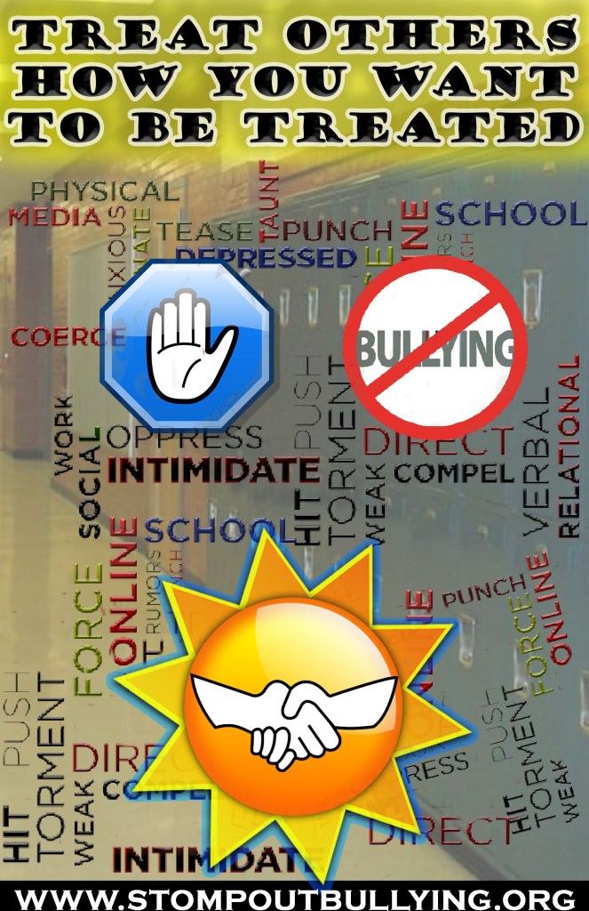
For this week, I was asked to make a social awareness poster. I decided to center the theme around bullying through both symbols and words. As someone who cannot stand bullying, I felt a desire to make my own personal social awareness poster of it. After initially getting some inspiration online and thinking about unique ways in which I could raise awareness, I ultimately came up with the final product you see. I wanted to make it clear that there are a ton of words and actions that can be considered bullying. I know it may feel a bit chaotic but that was the point. I want those who look at this to feel overwhelmed in a way because that’s how bullying makes people feel. There is so much that can be used to hurt someone I wanted to express that. For the technical aspects, I went with an 11 inch by 17-inch size with they typical RGB color mode and 150 PPI. When it comes to the work itself, the big technique I applied was layer masking. I used it on things like the sun, the school background, and some of the smaller bully words. I nondestructively adjusted transparencies and hid anything that looked undesirable. To make the website at the bottom stand out and not get lost amongst the chaos, I used the rectangle tool and filled it with white. For the slogan at the top of the screen as well as the bully words, I used the bevel and emboss effects to make them pop out a bit more. To make the top slogan be a bit more noticeable, I made a layer under it and painted it a low opacity yellow. Another thing I did was give a blue outer glow to the sun to make it appear a bit more interesting. One design principle I absolutely kept in mind for this is negative space. Before copying and pasting the bully layer a few times, it felt like there was too much-unoccupied space. To make it feel like there was not an overwhelming amount of it, I added in more words.