Retouching

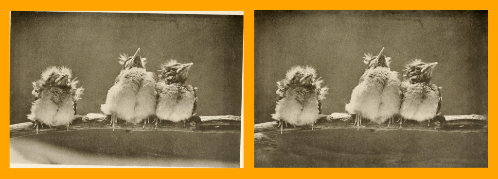
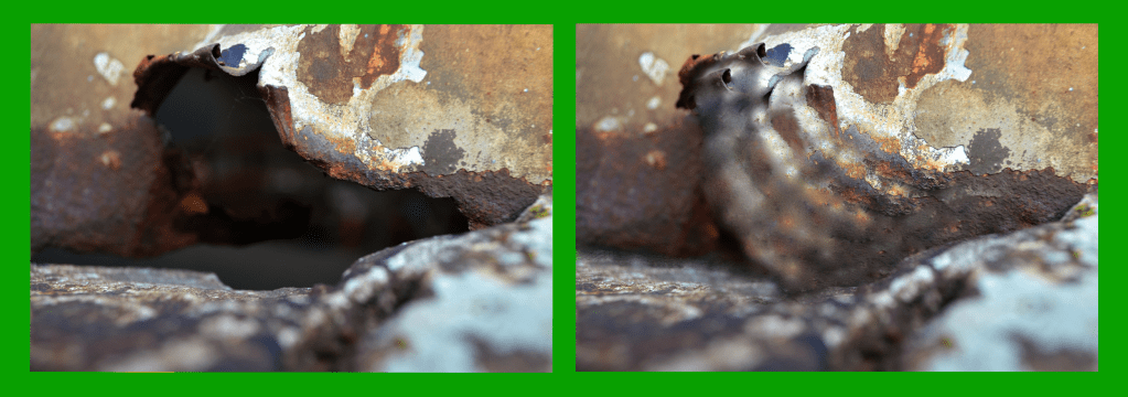
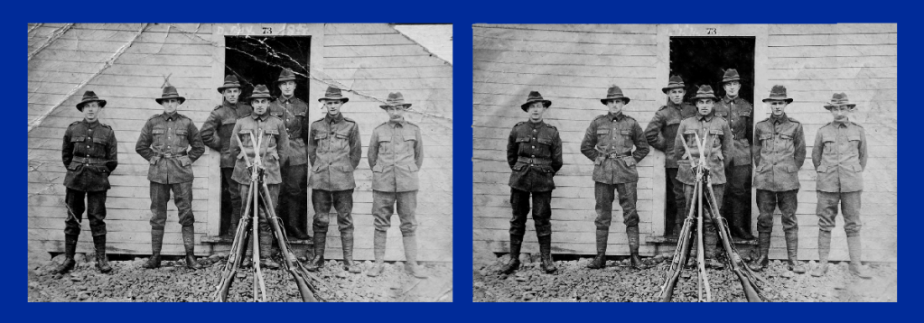
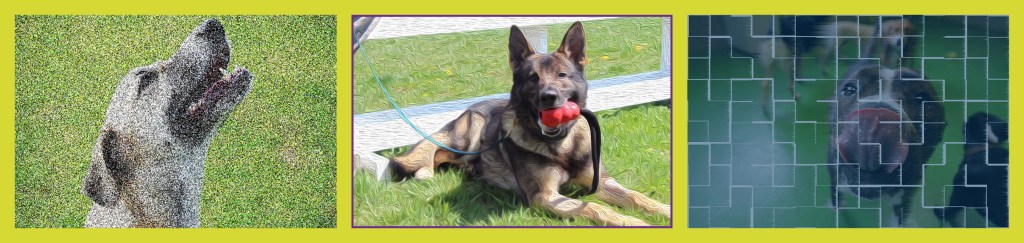
For this assignment, I was asked to retouch and repair 3 three different photographs then do a side by side comparison with the originals. I used the stamp tool, marquee tool, lasso tool, and healing brushes to restore and retouch the three individual images I chose. I wanted to find a few pictures that appeared ripped or damaged and fix them because I find the process fascinating. With picture A, I wanted to make the picture feel more complete. In terms of the technical aspects, the resolution for the photos is 150 ppi with RGB color mode enabled. In terms of exact dimensions, each photo differed. Retouch A was a large photo so the dimensions are 37 x 13 inches. Retouch B is 16.6 x 5.8 inches. Retouch C is 16 x 5.8 inches as well. The big design principal that found a constant theme in this week’s assignment is negative space. For each retouch comparison, the photos needed to be lined up next to each other while being spaced out equally with some sort of colorful border surrounding them. 

Masking and Composition

For this week, my classmates and I learned the basics of composition and selections as well as how to put it all together with what we learned with masking. There wasn’t much of a creative process with the beach scene as it was meant to be followed with exact instructions. The Netflix composition was a bit more interesting. For this project, the format consisted of a RGB color mode with a 150 ppi resolution and 8.5 by 11 dimensions. At first, there really wasn’t much of a creative process to follow since it was my plan to copy the original composition given to us. But as I started to work, I concluded that it was too challenging for me to get everything exact. So I ended up adopting a creative process where I’d make certain aspects of the composition look the same but also but my own twist and take onto other parts that I was having a hard time replicating. Take the clouds at the bottom of the screen for example. I couldn’t get the color the way I wanted it so I eventually decided to just change the saturation and color. I went with a color that I thought complimented the rest of the picture since I couldn’t get the exact color from the original composition. Also, I couldn’t get the space background where the rainbow colors are perfect so I just used a low saturation layer mask to make it appear similar but also in a way that I believed matched my artistic vision. In terms of some of the tools I used, I made use of the magic wand to make selections. I used the wand tool for all of the images exact for the Netflix title, the space background, and the rainbow background. To make more exact cuts, I used the rectangular marquee tool then the subtraction tool on the spaces I wished to get rid of. For the Netflix title, I couldn’t get the shadow from the original so I improvised with a drop shadow of my own using the effects option. One other issue I ran into was replicating the clouds on the bottom left and right. What I did to at least make it look similar is use the lasso tool on a selection of the middle cloud then adjusted their opacity using layer masks. The final problem for me was the moon. For the life of me, I could not get the exact shade I wanted. Because I was a little lost, I tried my best to replicate it by changing up the hue and saturation. Everything else in the process we basically just using layer masks and changing up layer orders. That’s how I got the space background to look the way it did.

Masking

For this week’s lesson, I was taught some of the basic concepts about layer masking in Photoshop. Here are my results after giving a few assignments a try.

For the assignment first assignment, there wasn’t any real techniques or design principles I used. There wasn’t any motivation behind it either. I mostly saw it as an opportunity to experiment and learn what was I was taught. The second assignment is a bit different, however. Unlike the first one where we were told what size to make the project, I decided to go small with 10 inch by 10 inch canvas. The resolution comes in at 150 ppi and the color mode is set to RGB. As for the design aspect, I decided to with an esports theme. As an avid fan of the Overwatch League, I wanted to make something creative to advertise the League’s upcoming games in Philadelphia. I wanted to make sure I captured the theme of this city by taking a photo of it and adding the team name and their star player. And to make sure people understand it’s about the Overwatch League, I made sure to include some sort of representation for it at the top of the screen. For tools, I made use of transparencies, exposures, and most importantly layer masks. For the title on top, I used a layer mask with a low opacity paintbrush. To make it look visually appealing, I used the dissolve feature. For the text towards the middle of the screen, I didn’t use a layer mask. But I did give it a black and orange gradient overlay to make it match the team colors of the Philadelphia Fusion. The text is the thing I want people to pay attention to and read since it’s trying to send a message. To make it stand out, I applied a layer mask to the picture of the city. Using a low opacity paintbrush, I painted in white right where the text was. Not only did this make the text more visible, but it also gave off a nice fog effect that I think adds to the piece nicely. For the player I put on there, I gave him the hide all layer mask. I wanted his presence to be subtle. He’s the star player on the team but he’s not the main focus. The goal was to make his presence be known but not take away from the rest of the piece at the same time. A layer mask was also given for the bottom layer for the same reason essentially. I didn’t want it to stand out more than the message but it’s important to have it be there since the Fusion are the team from Philadelphia. It implies that the road to the championship starts with them in their home city. With that said, the big design principle I focused on was emphasis. While I think I could’ve done better with it, I think I did make use of some negative space. The center of the screen is where the focus is but there is space on the left and right to give it breathing room.

Altered Images Assingment

For this week, I had to make set up 3 altered images in one file for my visual design class. For this assignment, I didn’t have any specific design considerations or methods in mind. I randomly just came up with the idea to use dogs. The one specific principle I chose to include was the idea of ethics we learned about in class. I made sure to pick pictures that I knew had the labeled for use with modification sign on it. With this being an introductory assignment, I treated it as an opportunity to experiment with different features on Photoshop that I had not yet explored. I played for a bit until I found 3 unique effects that I could use to make my selected photos look like art. For the leftmost photo, I used the pointillize feature then messed around with the brightness a bit. For the center picture, I gave it a purple frame and I distorted it to look more like a painting using filters. For the picture on the right, I applied a blue fill with low opacity as well as a tile filter. As for the dimensions, the canvas is 34.5 inches wide and 8.2 inches tall. The pixel sizing is 2488 x 592 with a resolution of 72 pixels per inch.  

Introduce Yourself (Example Post)

This is an example post, originally published as part of Blogging University. Enroll in one of our ten programs, and start your blog right.

You’re going to publish a post today. Don’t worry about how your blog looks. Don’t worry if you haven’t given it a name yet, or you’re feeling overwhelmed. Just click the “New Post” button, and tell us why you’re here.

Why do this?

  • Because it gives new readers context. What are you about? Why should they read your blog?
  • Because it will help you focus you own ideas about your blog and what you’d like to do with it.

The post can be short or long, a personal intro to your life or a bloggy mission statement, a manifesto for the future or a simple outline of your the types of things you hope to publish.

To help you get started, here are a few questions:

  • Why are you blogging publicly, rather than keeping a personal journal?
  • What topics do you think you’ll write about?
  • Who would you love to connect with via your blog?
  • If you blog successfully throughout the next year, what would you hope to have accomplished?

You’re not locked into any of this; one of the wonderful things about blogs is how they constantly evolve as we learn, grow, and interact with one another — but it’s good to know where and why you started, and articulating your goals may just give you a few other post ideas.

Can’t think how to get started? Just write the first thing that pops into your head. Anne Lamott, author of a book on writing we love, says that you need to give yourself permission to write a “crappy first draft”. Anne makes a great point — just start writing, and worry about editing it later.

When you’re ready to publish, give your post three to five tags that describe your blog’s focus — writing, photography, fiction, parenting, food, cars, movies, sports, whatever. These tags will help others who care about your topics find you in the Reader. Make sure one of the tags is “zerotohero,” so other new bloggers can find you, too.

Design a site like this with WordPress.com
Get started